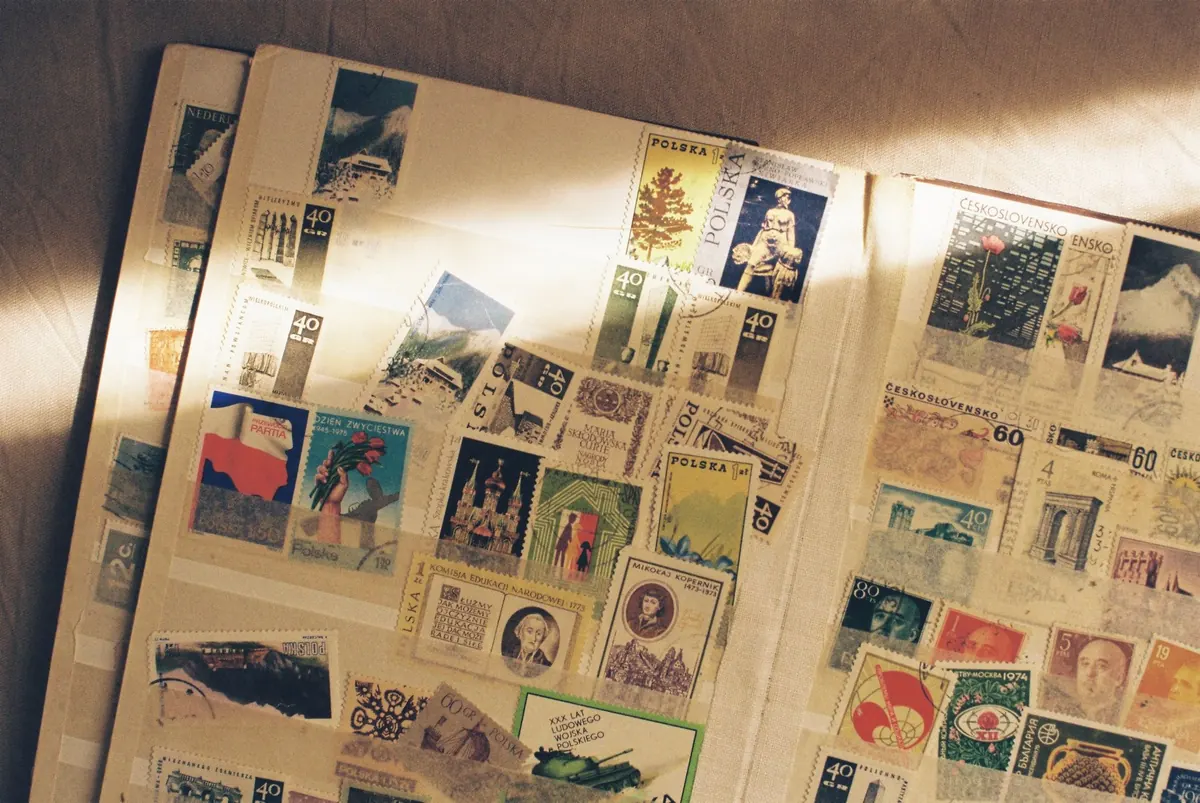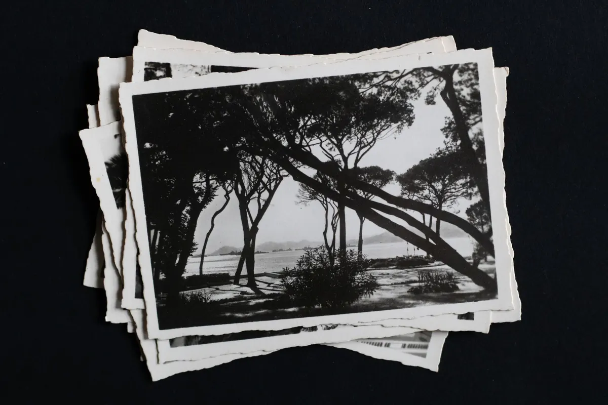
Tip a shoebox of old postcards onto a table and most of them look photographic. Some genuinely are. The rest were produced in the millions by lithographers and printers, and at arm's length they can fool you completely. The differences appear when you pick a card up, tilt it against the light, and turn it over.
Learning the handful of physical clues takes an afternoon. After that, you will rarely be caught out.
A real photo postcard, usually shortened to RPPC, is a photographic print made on paper that already had a postcard back printed on it. The image was formed by light and chemistry — silver salts suspended in a gelatin emulsion, exposed through a negative and developed into a continuous-tone picture. Occasionally you will find a genuine photograph pasted onto a separate postcard backing, which is a related but distinct thing.
A printed postcard was made with ink and a press. The picture is a pattern of dots, lines or stippled grain laid onto card stock. That single distinction is the root of every test below, because paper feel, surface sheen and the markings on the reverse all follow from how the image was made.
The real photo boom ran roughly from 1900 into the 1950s, with its peak before the First World War. Small-town photographers shot the main street, a school class, a flood, a funeral, a family beside a new car. They printed a few dozen copies on postcard-backed paper and sold them cheaply. For many towns and buildings, those cards are the only surviving photographs.
Hold two cards between finger and thumb and flex them gently. Photo paper is thinner and more pliable than commercial card stock. A real photo card often carries a soft curl across its width; a printed card tends to sit flat and stiff, resisting the bend.
Look at the sheen. RPPCs are glossy, semi-matte or matte, and that surface comes from the emulsion and its coating rather than a varnish. Printed cards from the 1940s and 1950s can be extremely shiny, but the shine sits on top of ink, like lacquer on a table.
Borders tell you plenty too. On a real photo card the white margin is usually the edge of the negative or the edge of the printing frame — thin, sometimes uneven, sometimes missing on one side. During the printed "white border" era, roughly 1915 to 1930, borders were machine-crisp and identical from card to card. Real photo cards were often trimmed by hand, so corners can be slightly rounded or unevenly cut.
A 10x jeweller's loupe costs very little and settles most arguments. A phone camera zoomed in, or a flatbed scan at high resolution, works nearly as well.
On a printed card you will find a screen. Halftone dots sit in a rigid grid, varying in size to suggest tone, and they are easiest to spot in skies, water and flat walls. Rotate the card: the pattern never moves relative to the image. Chromolithographs show a fine stipple and often slight misregistration, where one colour plate sits a fraction out of line and leaves a coloured fringe along an edge. Collotype prints are the trickiest, with an irregular grain that looks photographic at a glance — but the surface is still ink on card.
A real photo card shows continuous tone. Magnify a patch of shadow and it slides smoothly toward black with no dots. Instead you will find photographic artefacts: dust specks, fine scratches, vignetting, a soft corner where the lens fell off, the occasional light leak.
Colour deserves its own note. Many real photo cards were coloured by hand over the print, and the brushwork shows — tint that stops abruptly at a hat brim, colour laid unevenly across a sky, brush strokes visible under the loupe. Printed colour sits in the ink layer and aligns with the printing. Tilt a genuine older print and you may see silvering: a bluish or purplish mirror sheen in the dark areas, a normal sign of ageing gelatin silver. Printed cards do not silver out. They fade, drift yellow-orange, or crack in their coating.
Photographic paper was sold pre-printed with a postcard back, so its branding turns up on thousands of otherwise unrelated cards. Kodak's AZO paper is the classic example: a stamp box with the letters AZO framed by four small triangular corner marks. The orientation of those marks changed over the decades, and collectors keep a dating chart to hand because of it. Other names to watch for include Velox, Cyko, Artura, Defender, Kruxo and Ribbon, often stamped inside the stamp box or printed along the top edge.
Printed cards carry a publisher's imprint, a series number, an artist's signature, or a country of origin such as "Printed in Germany" from the years before the First World War. Real photo cards more often carry the photographer's name and town, and a negative number scratched or written into the negative itself, which is why it appears in white inside the picture, usually near a bottom corner. Rubber stamps and studio labels on the reverse are common as well.
The back also dates a card. In the United States, a divided back — message and address on the same side — was permitted from 1907. Before that, messages were written on the picture side. Be careful with the spelling "Post Card" against "Postcard"; it is repeated as a rule but is not reliable on its own.
Some cards look photographic but were never near a darkroom. The Photochrom prints sold by the Detroit Photographic Company in the 1890s and 1900s are lithographic, and they are beautiful, but they are ink. Curt Teich's linen-era cards, marked "C.T. Art-Colortone", imitate colour photographs on a textured stock and are firmly printed products.
Then there are reproductions of real photo cards: halftone copies made from an original print, which betray themselves with a dot screen and a suspiciously crisp back. Modern inkjet and laser reprints are glossier still. Under magnification, inkjet output shows scattered colour droplets and soft edges, while laser toner sits on the surface and can be scraped off with a fingernail. Scanned backs often look slightly blurred or moiré-patterned rather than sharply printed.
Finally, a genuine photograph glued to a printed postcard back is technically a photo postcard, though not a manufactured RPPC. Check for glue staining, a thickness that feels wrong, and a back that does not match the age of the image.
Sort twenty cards into two stacks, then argue with yourself about the doubtful ones. The loupe and the lamp will decide nearly all of them, and the backs will settle the rest. Handle everything by the edges, keep cards out of damp rooms, and store them in acid-free sleeves rather than albums with sticky corners.
If you are buying, selling or insuring anything of value, a specialist dealer or paper appraiser is worth the fee — condition, rarity and local demand move prices far more than a single dating clue. For the everyday pleasure of it, though, a loupe, a lamp and a little patience will tell you what you are holding.
Photo: Fiona Murray / Pexels